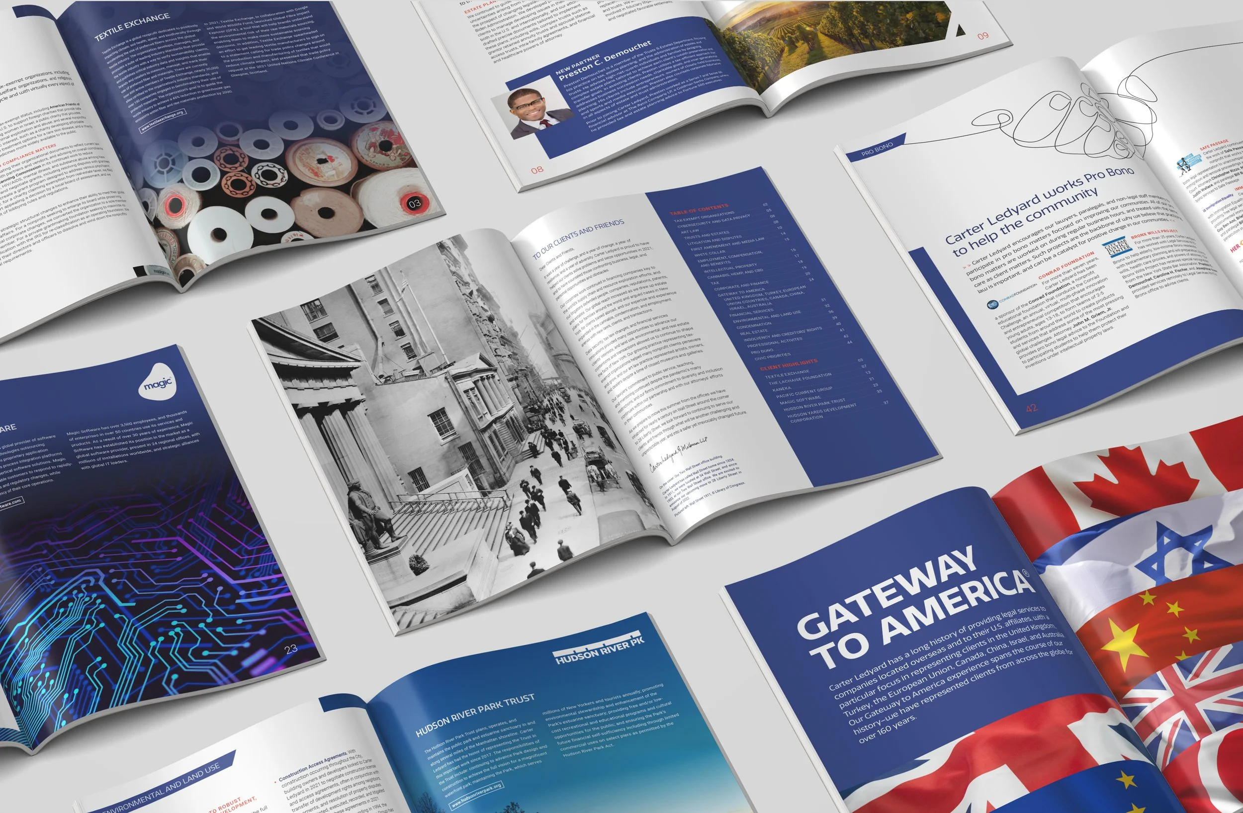
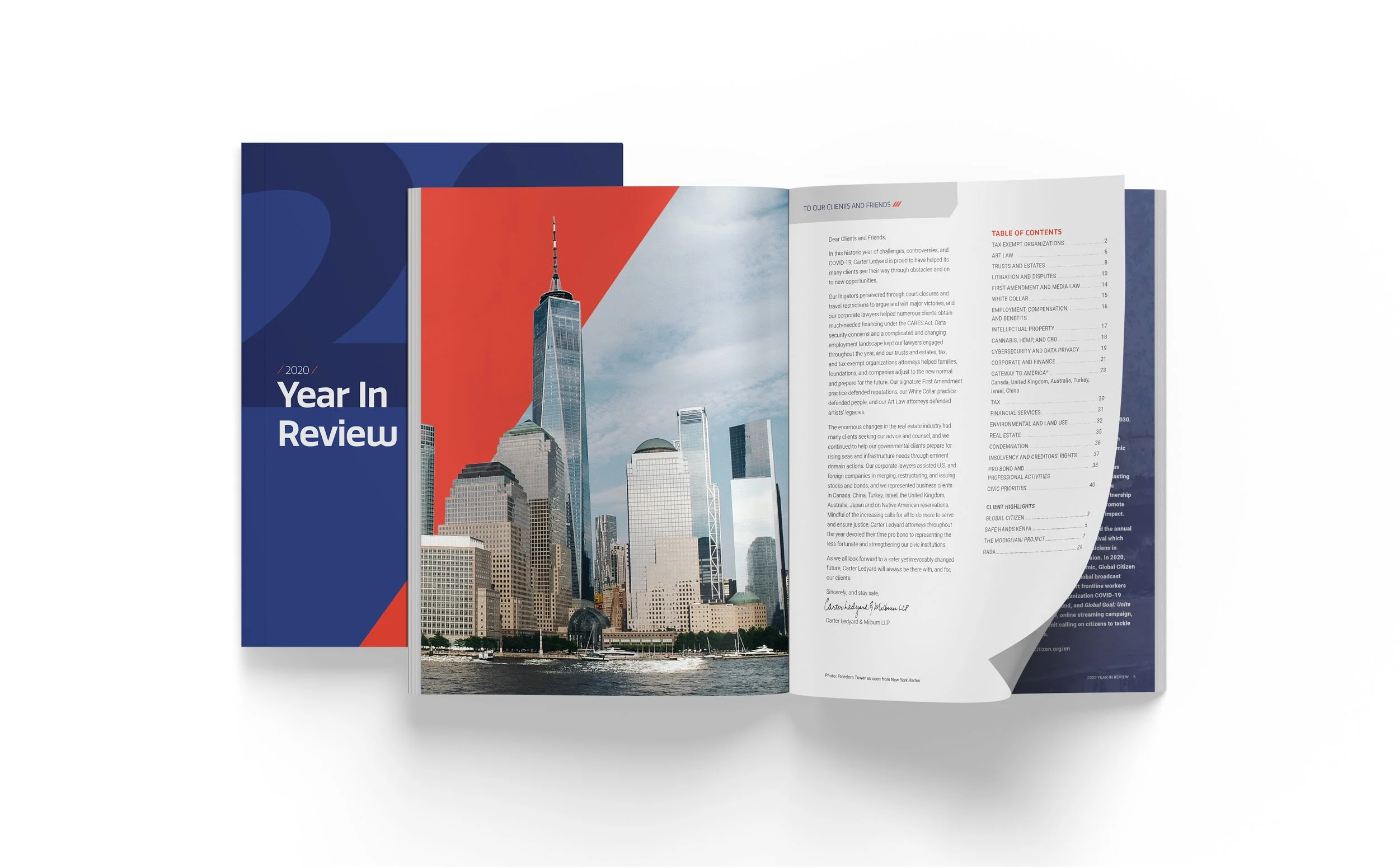
CARTER LEDYARD | YEAR IN REVIEW
Crafting a cohesive story from many voices.
Founded and headquartered on Wall Street since 1854, Carter Ledyard & Milburn is a New York City law firm through and through. Franklin D. Roosevelt was an associate at Carter Ledyard before he became Governor of New York and, later, President of the United States.
As the designers of this prestigious firm’s annual report for 5 years running, we’ve cycled through the usual creative challenges and rewards engendered by this kind of work. The last couple of years, however, brought two developments that changed a lot (for us): The arrival of new brand guidelines with a refreshed brand identity, and an interim CMO who managed a committee of key stakeholders in the creative process.
Read more ⌟
A fresh yet recognizable face
Every year is different, but the structure and strictures of an annual report for the most part stay the same. That’s where the balancing act comes in: staying on brand while switching it up enough to be distinctive and relevant to that year’s story. CLM granted us a fair amount of freedom for design exploration, trusting that we would bring a very brand-specific feel to their preferred editorial style. Our ability to identify and purchase stock photography that feels high-end, custom, and artistic played a big role in delivering the appropriate yet eye-catching look.
More fresh faces at the table
New management always requires some adjustment on the creative side, but incorporating input from numerous stakeholders is the path least conducive to good design. (There are many reasons why designers say “a camel is a horse created by committee.”) In this instance there was both an interim CMO and a great many people invested in the annual report, including every one of CLM’s practice leads. And almost every one of them had input to share.
But we are always open to the possibility of pleasant surprises and were rewarded with one here. The interim CMO stepped up and acted as the filter; we put on our listening hats and sharpened our virtual pencils. The dreaded camel never materialized: in fact it was quite the opposite. The completed piece is vibrant and clean, inviting to look at and read. A fitting year-end review for this venerable firm, and a satisfying resolution for us.


