BLB&G | BRAND IDENTITY
Making a strong case for teamwork.
Widely recognized as a leading law firm that has prosecuted some of the most significant employment discrimination, civil rights and consumer protection cases on record, BLB&G’s distinguished reputation is driven by discipline, clarity, and purpose.
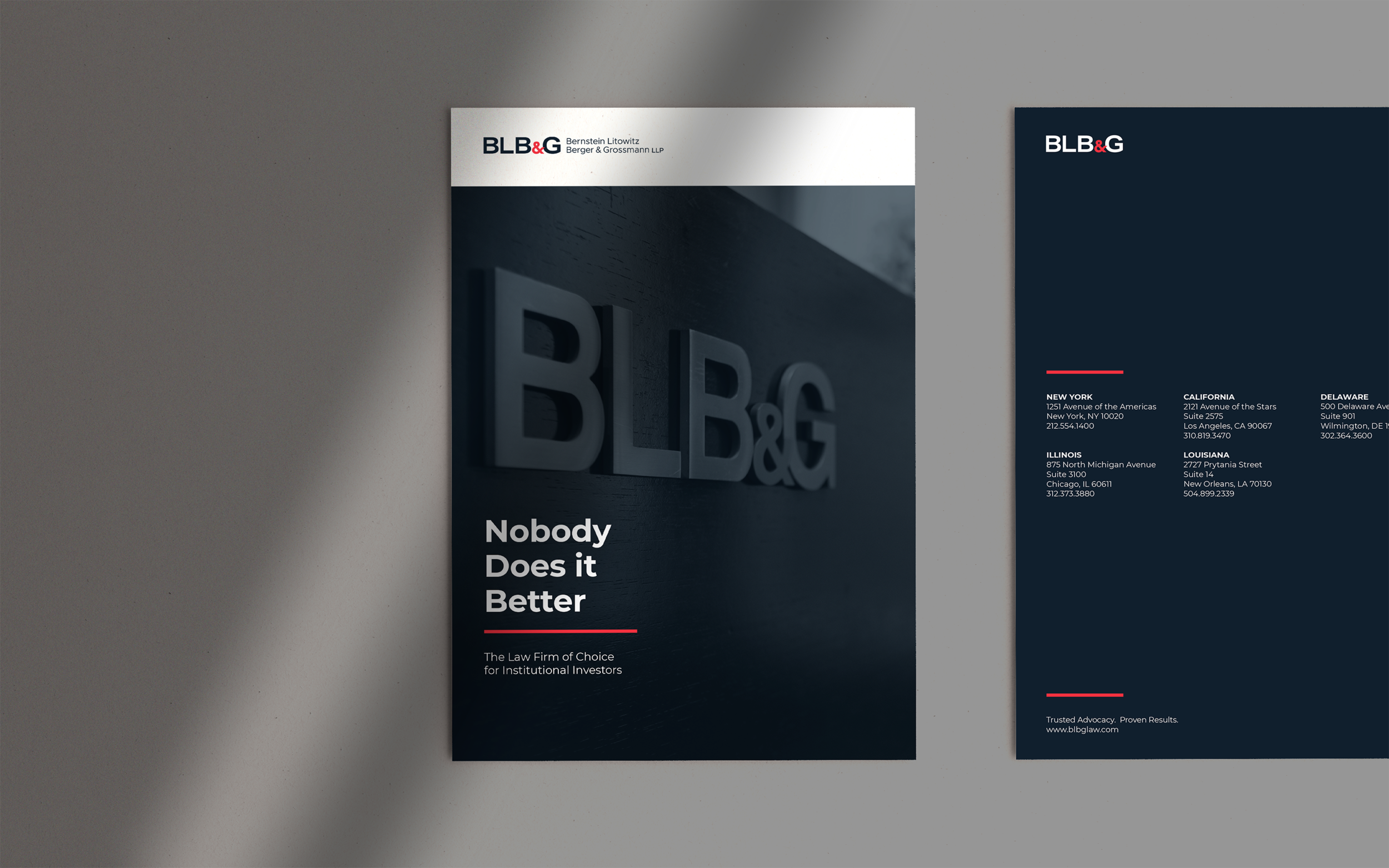
Their brand refresh, featuring a typographic logo and dramatic, intentionally limited color palette, captured the essence of the practice but presented some novel challenges. As the designated brand implementers, our ability to fill a variety of roles for the marketing team proved as central to getting the job done as our design choices and technical skills.
Read more ⌟
True colors
Implementing and rolling out the colors selected by the external rebranding team proved to be a challenge. The Pantone navy blue was a very dark, deeply saturated blue—a striking choice. But when translated into the CMYK color required for print use, its unusual color veered very close to black.
Once we figured out a way for the deep navy to read, we were inspired by the brand’s narrow palette and the confident choices it expressed. Although the red was specced as an accent color, it became the bold foundation of a business card and an unexpected, attention-getting envelope side. The crisp white was the perfect foil for the dark navy and scarlet.
Resilient ties
BLB&G’s internal marketing team was lean but the scope of work for this assignment was not. Depending on what was required at each stage of the process, our role shape-shifted between being part of the internal team and a trusted outside partner—sometimes both at once. Although those situations aren’t generally considered ideal, we’ve navigated them often enough to appreciate the advantages (real-time communication, relationship building, seamless teamwork) and avoid the pitfalls (boundary breaches, internal politics). In this case it worked out to be the best of both worlds.


