RIVERKEEPER | BRAND REFRESH
Protect. Restore. Connect.
How did the Riverkeeper brand evolve? Much like the river it protects, it developed organically through years of gradual changes. Recently, Riverkeeper recognized the need to refresh its logo and establish a cohesive visual identity that aligns with its mission of safeguarding the Hudson River for all life.
The enhanced Riverkeeper brand boasts a warm yet authoritative tone, featuring an engaging and instantly recognizable logo and color palette that resonate with the environment it serves.
Read more ⌟
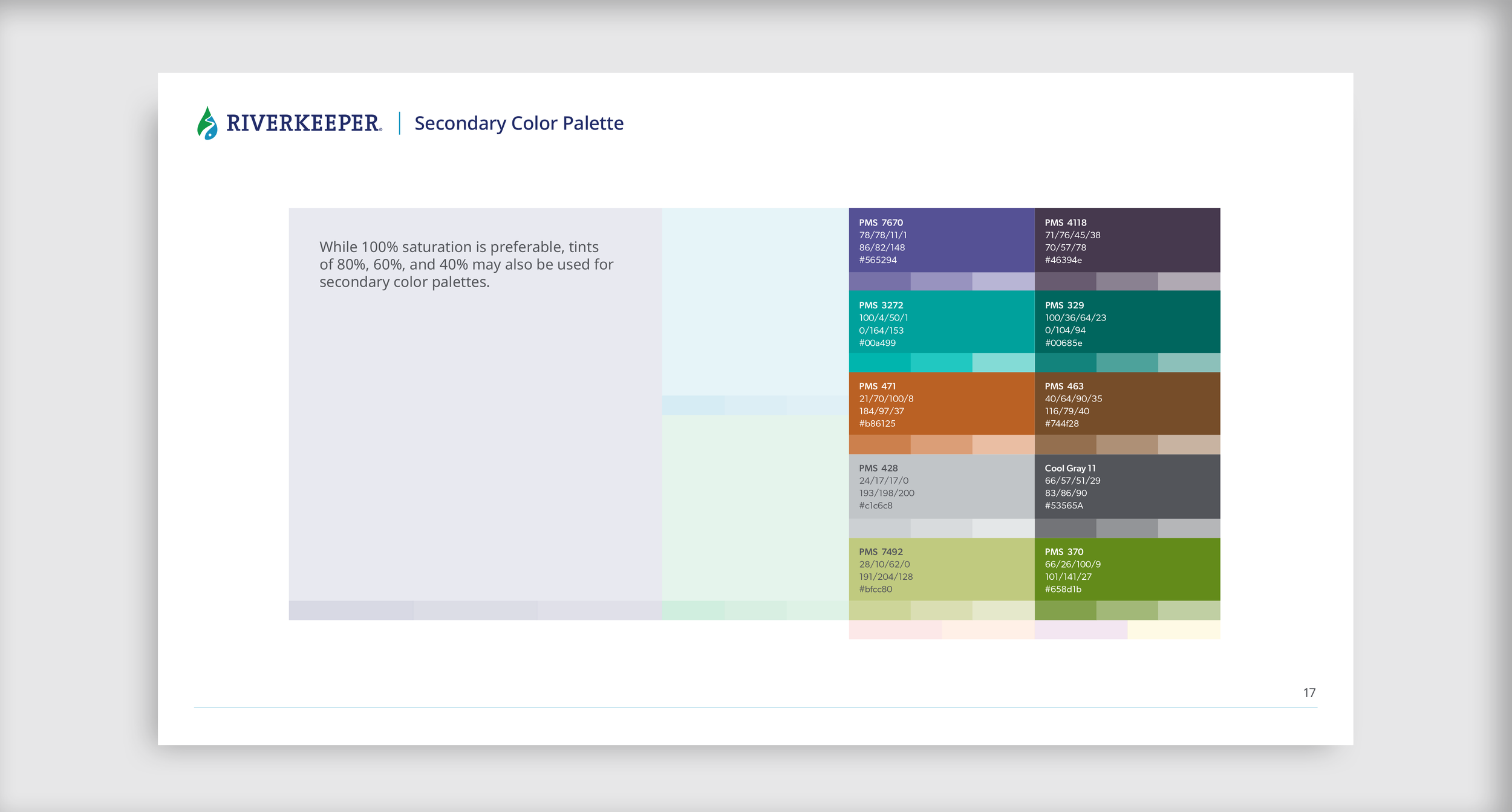
Brand personality
Our new visual identity system is designed around the attributes, style, connections, and intersections personified by the Riverkeeper brand. Drawing on both research and a strategy provided by Riverkeeper, we identified four key tone controls that shape how the audience perceives the organization and its mission:
Authoritative - Highly credible yet nimble and scrappy, Riverkeeper combines decades of experience with breakthrough research to arrive at thoughtful, creative solutions.
Joyful - Filling a broad space at the intersection of recreation and resource protection, Riverkeeper celebrates a wide and richly varied range of wins for the Hudson River.
Spiritual - Riverkeeper serves as a connector, creating a deep sense of belonging, purpose, community, and wonder.
Independent - Riverkeeper is a strong, clear advocate and proponent of bipartisanship. They honor our fragile, irreplaceable ecosystem best by aligning themselves with rigorous science.
Design development
When developing the logo refresh and new identity, the Riverkeeper marketing team gave one absolute directive: “Don’t touch the wordmark!” Hence, our task was to refresh and refine the logomark instead, and create a visual identity system that would resonate with a broader audience. In other words, use a deft light touch.


“Don’t touch the wordmark!”
The Riverkeeper wordmark, is a registered trademark used by local Riverkeeper organizations around the world.
Our task was to subtly shift the logo mark and develop a new visual identity system so it would resonate with a broader audience while maintaining the integrity of the word mark.